
Figures
Interactive figures with steps, sliders and runnable code
Write an interactive figure as raw HTML in a <figure class="fx"> box and name its kind with data-fx. The site adds the controls, highlights and transitions in the browser; without JavaScript the page shows the elements marked to the end and all captions.
Figures suit sequences and state changes, side by side comparisons of the same transition, values that change with a slider, and a prediction the reader checks by running code. Static structure stays an image or a diagram.
Supported since 0.28.0.
Overview
| Kind | data-fx | What the site adds |
|---|---|---|
| Steps | steps | A bar with play, previous, next, a scrubber and n / N; elements that show, highlight or move per step; one caption at a time |
| Tabs | steps with data-labels | Tab buttons instead of the play bar |
| Slider | range | The ratio as --fx-v, the value as data-value, the <output> text and an fx:input event |
| Run box | run | Buttons that run the code block right above it in a sandbox and show the console |
| Custom | custom | Nothing but the icon buttons. Your own <script type="module"> draws the scene |
Keep no blank lines inside an HTML block. A blank line ends the block and Markdown parsing starts again.
Give every figure an aria-label that names what it shows, and write the point of the figure in the body text as well.
Steps
Mark the elements of the scene with step ranges. data-on shows the element only on those steps, data-hl paints a highlight on them, and data-pos moves the element to a position from that step on.
A range is 3, 2-5, 4- (to the end) or -2 (from the start), and several ranges are separated by spaces. A position is step:x y in pixels, and several positions are separated by ; in step order.
data-steps sets the number of steps. Without it, the number of items in <ol class="fx__captions"> is used. One caption is visible per step. A steps figure with neither data-steps nor captions gets no bar.
A hidden element keeps its place in the layout. To show different elements in one place, put them in an fx-swap box.
Source
<figure class="fx" data-fx="steps" aria-label="A request passes the cache">
<div class="fx__stage">
<div class="fx-row">
<span class="fx-chip" data-on="-2">Request</span>
<span class="fx-chip" data-hl="2">Cache</span>
<span class="fx-chip fx-chip--mine" data-on="3-">Response</span>
<span class="fx-chip" data-pos="1:0 0;3:24 0">Moves right on step 3</span>
</div>
</div>
<ol class="fx__captions">
<li>The request leaves the browser.</li>
<li>The cache is checked.</li>
<li>The response comes back.</li>
</ol>
</figure>
Result
- The request leaves the browser.
- The cache is checked.
- The response comes back.
Play holds each step for two seconds and makes the first change half a second after the click, because the scene on screen has already been read. Pressing play on the last step starts again from step 1.
The left and right arrow keys also move one step while the focus is inside the figure. Previous and next stay focusable at both ends and are marked aria-disabled there.
Tabs
With data-labels, the bar shows one tab per label instead of play, previous, next, the scrubber and the count. Separate labels with |. Set data-steps when there are no captions to count.
<figure class="fx" data-fx="steps" data-labels="Before|After" data-steps="2" aria-label="Before and after">
<div class="fx__stage">
<div class="fx-swap">
<p data-on="1">Before: one request per page.</p>
<p data-on="2">After: one request per session.</p>
</div>
</div>
</figure>
Before: one request per page.
After: one request per session.
Slider
Put an <input type="range"> and an <output> inside the figure, and name the input with a <label>. Keep the <output> outside the label, because a label names one control; the fx__range row lines them up. The site writes the value to the <output>, with data-unit appended, and gives the figure the ratio between min and max as the --fx-v variable, so the scene can use it in calc().
Source
<figure class="fx" data-fx="range" aria-label="Cache lifetime">
<div class="fx__stage">
<div class="fx-box" style="width: calc(20% + var(--fx-v, 0) * 80%)">Lifetime</div>
</div>
<div class="fx__range"><label for="cache-seconds">Seconds</label> <input id="cache-seconds" type="range" min="0" max="60" value="30" data-unit="s"> <output></output></div>
</figure>
Result
Run box
Put an empty <div class="fx" data-fx="run"></div> right after a code block. The site adds Run, Edit code and Reset code buttons and shows what the code prints.
Edit code opens the code in a text box and becomes Close editor while the box is open, and Run runs what is in the box. Reset code stops a run in progress, puts the written code back and clears the output.
console.log, info, warn and error, uncaught errors and rejected promises are shown one per line. Strings are printed as written, objects and arrays as JSON, and functions by name.
Source
```js
const seen = new Set([1, 2, 2, 3]);
console.log(seen.size, [...seen]);
```

<div class="fx" data-fx="run"></div>
Result
const seen = new Set([1, 2, 2, 3]);
console.log(seen.size, [...seen]);
Sandbox
The code runs in a hidden <iframe sandbox="allow-scripts"> with no other permission. It has no same-origin access, so it cannot read the page, its cookies or its storage, and it cannot navigate the page or open dialogs such as alert.
Output is collected for two seconds after Run, and then the frame is removed. For code that prints later, set data-wait on the run box in milliseconds.
The sandboxed frame shares the main thread of the page, so an infinite loop in the code can freeze the whole page. Write demos that finish on their own.
Each run gets a new frame and the next number of a counter kept per figure. A console line is shown only when it comes from that frame with that number, so the output of an earlier run or of another figure never mixes in.
Custom scenes
A figure of kind steps can also be drawn by your own script. Listen for fx:step on the figure and draw the scene for event.detail.step from scratch, so dragging the scrubber backwards shows the right scene.
The figure events do not bubble. Listen on the figure itself, not on a parent element; the same goes for fx:input of a slider.
To change the step from your script, dispatch fx:goto on the figure. new CustomEvent("fx:goto", {detail: {step: 1, play: true}}) restarts it from step 1. Only steps figures handle fx:goto.
<figure class="fx" data-fx="steps" id="count" data-steps="3" aria-label="Counter">
<div class="fx__stage"><p class="fx-box" id="count-out"></p></div>
</figure>
<script type="module">
const root = document.getElementById("count");
root.addEventListener("fx:step", (event) => {
  document.getElementById("count-out").textContent = `Step ${event.detail.step} of 3`;
});
</script>
A module script runs before the site sets up the figures, so the listener also receives the first fx:step.
For a scene with no steps, such as a map the reader drags, use data-fx="custom". The site leaves it to your own <script type="module"> in the same document; add the fx--ready class when it is set up.
In every kind of figure, a button with data-icon gets the same icon as the bar, with its text as the name. Buttons inside a <div class="fx__bar"> and buttons with the fx-button class get the bar’s style, and aria-pressed="true" marks the pressed one.
Marked image
Supported since 0.31.0.
To point at parts of a screenshot, put numbered boxes over the image in a <figure class="fx-shot">. The boxes are placed in percent of the image, so they stay on their parts at any width. A switch on the top right border turns them off to show the plain image. The figure needs no JavaScript.
Source
<figure class="fx-shot" aria-label="Reading list with two marked parts">
<div class="fx-shot__frame"><img src="../asset/sample.svg" alt="A fictional reading list" width="560" height="160"><div class="fx-shot__marks" aria-hidden="true"><i style="left:3.6%;top:12.5%;width:37.5%;height:23.8%"><b>1</b></i><i style="left:67.9%;top:41%;width:28.6%;height:47%"><b>2</b></i></div></div>
<label class="fx-shot__toggle" title="Marks"><input type="checkbox" checked aria-label="Marks"></label>
</figure>
Result
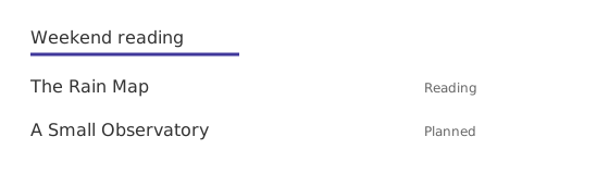
Describe the parts below the figure, in a table or a list numbered like the boxes. left, top, width and height are percentages of the image size. Without the switch the boxes always show. Name the switch with title, shown on pointing, and aria-label.
Reference
Attributes
| Attribute | On | Meaning |
|---|---|---|
data-fx | the figure | steps, range, run or custom |
data-steps | a steps figure | Number of steps. Without it, the number of fx__captions items |
data-labels | a steps figure | Tab labels separated by | |
data-on | an element | Steps on which the element is visible |
data-hl | an element | Steps on which the element is highlighted. Inside SVG, put it on a rect.fx-mark |
data-pos | an element | step:x y pairs separated by ;. The element moves by that many pixels from that step on |
data-unit | the range input | Text appended to the output value |
data-empty | a run box | Text shown while the output is empty |
data-wait | a run box | Milliseconds to collect output. Default 2000 |
data-step | a steps figure, set by the site | The current step, for selectors such as .fx[data-step="3"] |
data-value | a slider figure, set by the site | The current input value |
data-icon | a button | play, pause, prev or next. The button text becomes its name |
Events
| Event | Direction | detail |
|---|---|---|
fx:step | figure to your script | {step} after every step change or move request, including the first |
fx:goto | your script to figure | {step, play}. Both optional, step defaults to 1. play: true starts playing from that step. An invalid detail goes to step 1 without playing |
fx:input | figure to your script | {value, ratio} on every slider change, including the first |
Classes and variables
Layout classes: fx__stage (the scene), fx__captions (one li per step), fx-cols (a grid that stacks on narrow screens), fx-pair (two scenes side by side), fx-scroll (an SVG that scrolls sideways on phones), fx-row (a wrapping row), fx-lane (a bordered row of chips), fx-swap (children stacked in one place). A <figcaption> is shown in small gray text.
Control and state classes: fx__range (the slider row), fx__bar (a bar of your own buttons), fx--ready (on a figure once it is set up; the site adds it, and your script adds it to a custom figure), is-on and is-hl (the step states the site toggles on data-on and data-hl elements; a custom figure’s script may toggle them on its own data-on and data-hl elements).
Element classes: fx-box, fx-chip with fx-chip--mine and fx-chip--dash, fx-lines (a list of code lines), fx-label, fx-muted, fx-button. Inside SVG: fx-strong, fx-muted, fx-mono for text and fx-box, fx-mine, fx-ground, fx-dash, fx-ln, fx-ln-strong, fx-arrow, fx-mark for shapes.
Variables on the figure, which your own styles can read: --fx-line, --fx-line-strong, --fx-ink, --fx-ink-strong, --fx-ink-muted, --fx-fill, --fx-ground, --fx-mark, --fx-ph, --fx-ease. They follow the light and dark theme. A slider figure also carries --fx-v.
Marked image classes: fx-shot (the box), fx-shot__frame (the image area), fx-shot__marks (the layer of boxes, one i per box with a b number), fx-shot__toggle (a label around a checkbox).
Without JavaScript
The page shows the server HTML. Elements without data-on or whose data-on ends with - are visible, highlights are not painted, data-pos elements stay where they are written, every caption is listed, there is no bar, and a run box shows nothing below the code block. Mark the elements of the last step with an open range such as 3-, not 3, and write the scene so that this view alone carries the point.
Language
The names of the bar buttons, the scrubber, the run box buttons and the code box, and the text of an empty run box, are English, and Korean when the page language is ko or a regional form of it such as ko-KR, like the date labels under the title.